MFS DC Investments
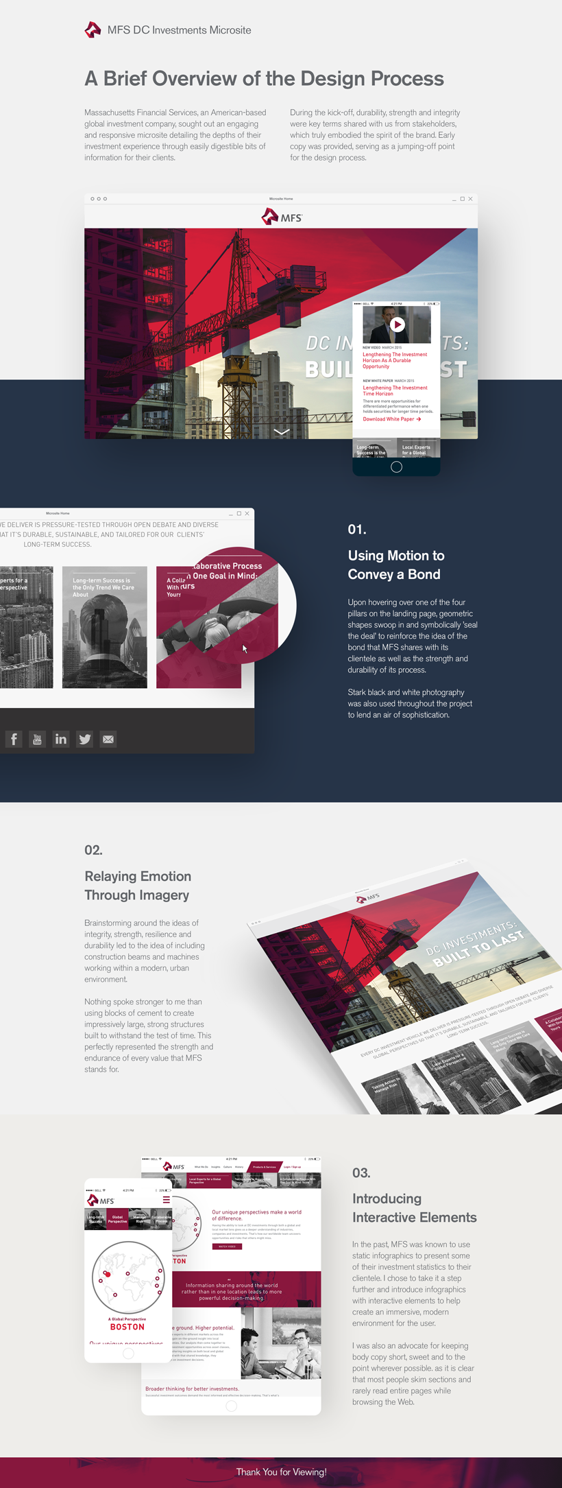
MFS, an American-based global investment company, sought out an engaging and responsive microsite detailing the depths of their investment experience through easily digestible bits of information for their clients. My concept was chosen for development amongst three other designers' works.
Sealing the Deal
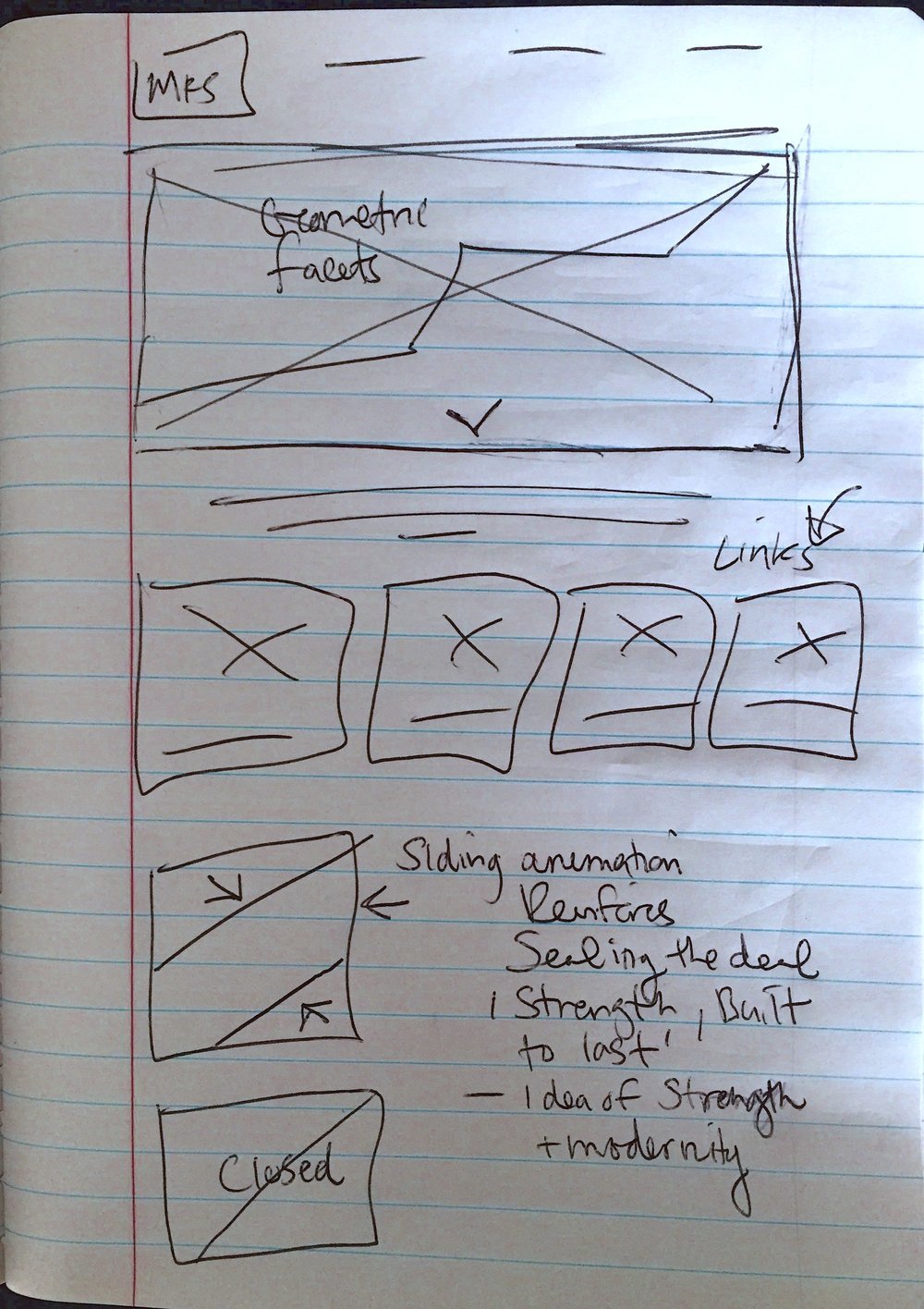
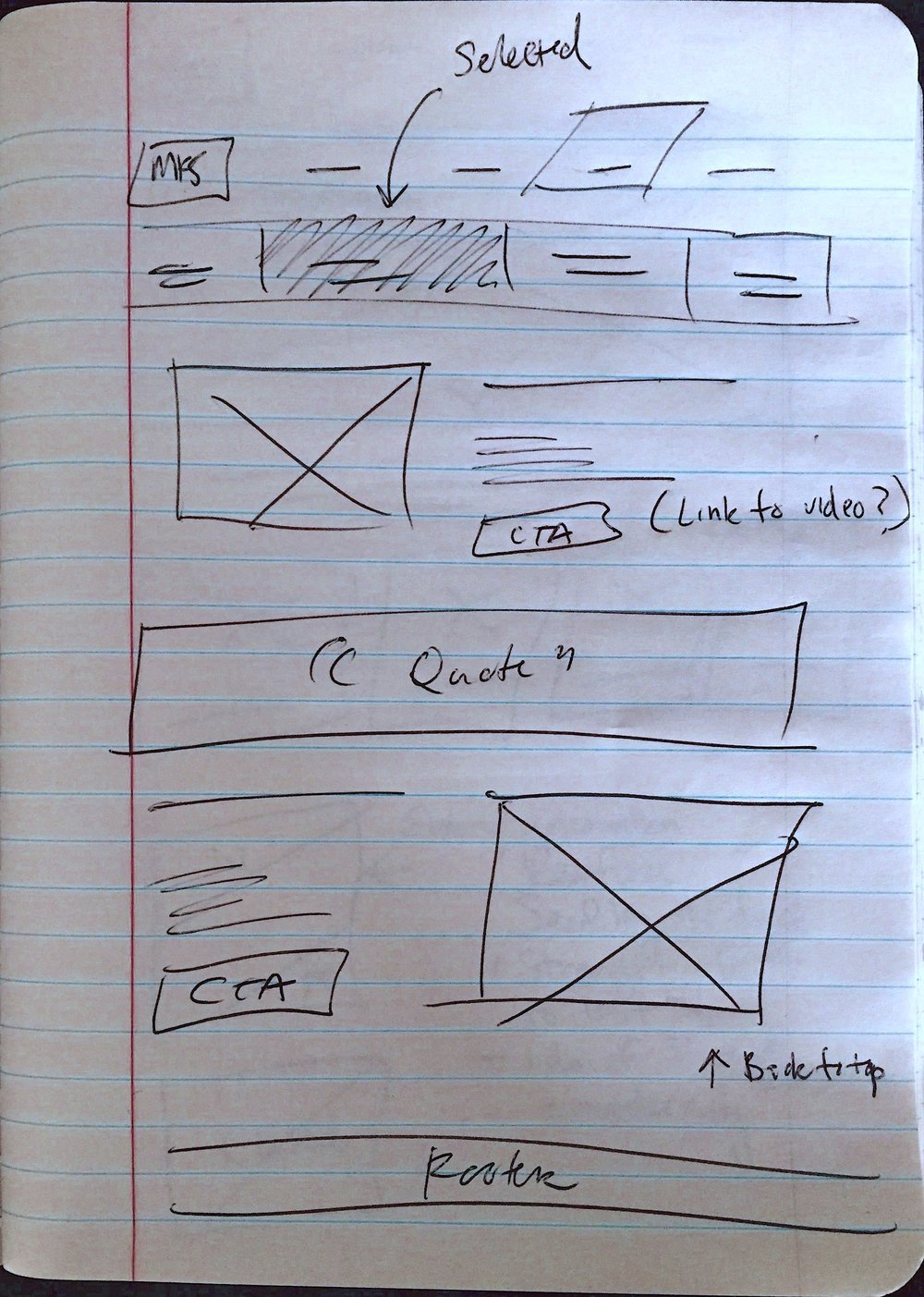
I began work on some high-level sketches and wireframes for the landing page and inner sections and have shared a few of them below to help further understand my thought process. I immediately became excited by the idea of ‘sealing the deal’ and reinforcing the strength and heritage of the brand. I thought to explore micro-interactions that could lend themselves to those ideas.
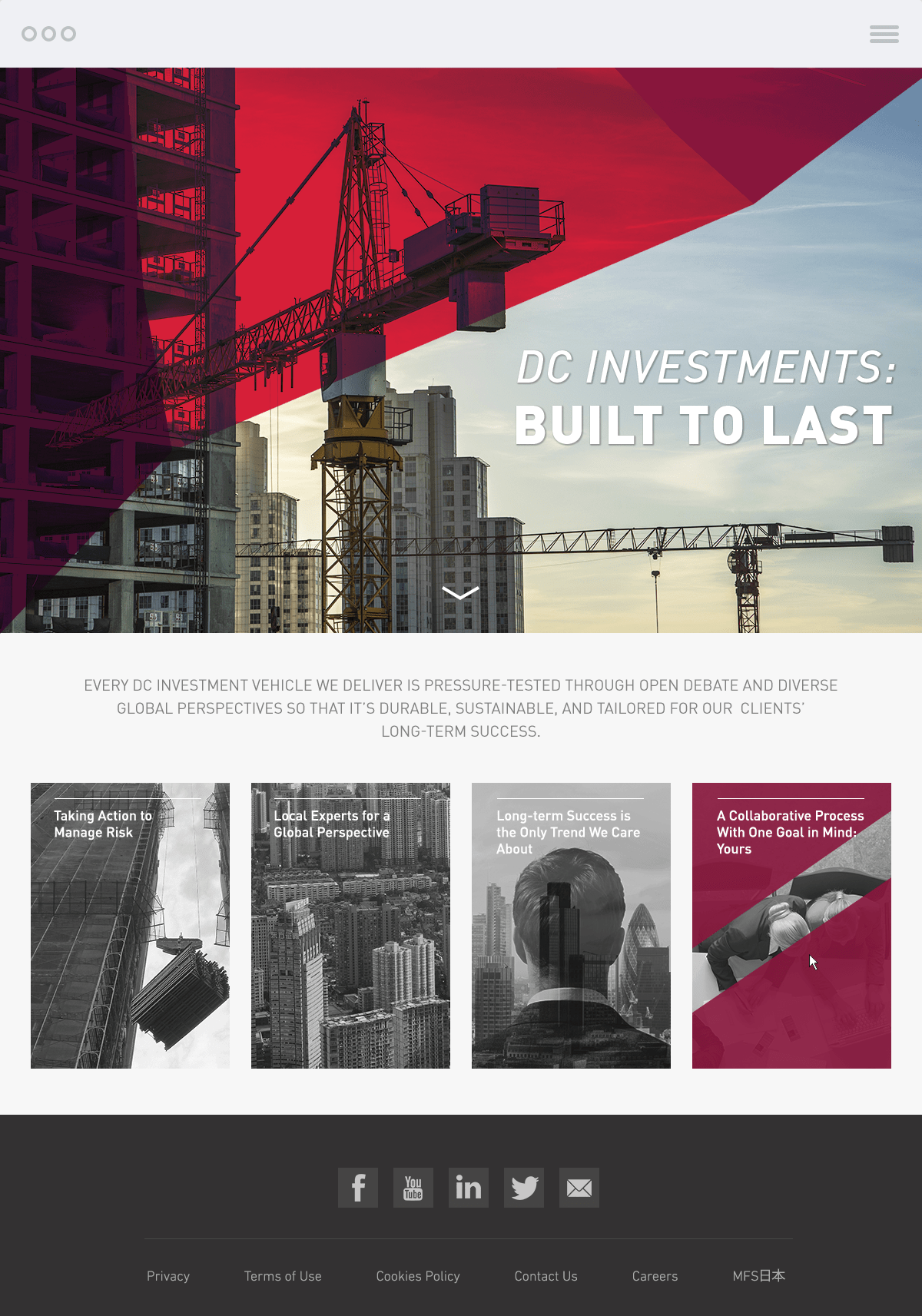
I decided that when a user would hover over a linked tile, it would begin to close and turn a deep red. The stakeholders loved this concept and it helped shape the rest of the layout. I then began to design the web and mobile mockups with the client’s feedback at hand and using the existing brand identity to help solidify the concept.


The End Result
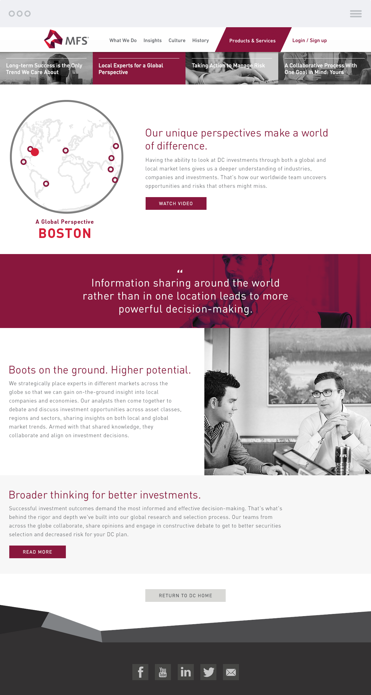
A clean, forward-thinking design that perfectly encapsulates the valuable tools they provide while embodying the company's hard-working ethic. Learn more about the design process in greater detail below.
Ideation Phase
