Reducing loan processing time from 5-10 minutes to 1-2 minutes
I designed a mobile analytics tool that cut loan processing time by 80%—from 5-10 minutes down to just 1-2 minutes, helping Freddie Mac executives make faster, smarter decisions about loan quality on the go. I focused on creating a smooth, user-friendly experience while collaborating closely with copywriters, developers, and my project manager.
Glorified pixel-pusher and so much more
Design lead, Product strategy, User research, Interaction, Wireframing, Visual design, Prototyping & testing, IA

Product impact: KPIs that reflect the design journey
Setting the stage with Double Diamond & lean UX
My design process is all about the Double Diamond Theory and Lean UX. I make sure to weave in the essential phases of Discovery, Definition, Ideation, and Implementation in every project. It’s all about exploring ideas, refining them, and bringing them to life.
Uncovering Freddie Mac's needs: Smart tools for executives
Through conducting discovery sessions with the client and a BA, a few things became clear:
Customers want to feel confident and secure when selling loans to Freddie Mac. They need tools that allow them to easily analyze the performance and status of loan products throughout the manufacturing process. Unfortunately, the current tools are a bit clunky and outdated, making it tough to navigate efficiently. This lack of integration can turn decision-making into a challenge, making it difficult to spot errors along the way.
Executives are looking for quick and easy access to business intelligence solutions, but the fragmented tools they have just aren’t cutting it. Plus, Freddie Mac currently doesn’t offer mobile applications, which is a missed opportunity. Their audience is quite diverse; while some tech-savvy customers love using mobile apps, many still rely on good old paper reports. With all these varying needs, creating a modern, unified solution is more important than ever.
What I learned: Executives crave speed, simplicity, and easy access
It was time to dive into research. I kicked things off by chatting with executives across the organization to get a clearer picture of their needs and challenges.
These conversations led to some key revelations:
Near real-time actionable data. In the fast-paced world of loan processing, speed is everything. The LAS Mobile App needed to deliver near real-time data to keep things flowing smoothly. Executives rely on this feature to make fast, informed decisions that keep the wheels turning.
Aggregated data view. Executives want a clear snapshot without drowning in details. The app should provide just the right amount of high-level information, striking the perfect balance between simplicity and functionality.
Deeper data via web portal. When more in-depth analysis is needed, the app will seamlessly connect with Freddie Mac's web portal, allowing managers and analysts to dig deeper into the details. This keeps the app user-friendly while providing full support when necessary.
On-the-go access. Executives are always on the move, and so should their data be. The app is designed for easy, on-the-go access, ensuring crucial info is always right at their fingertips.
Once I gathered all the insights, I dove into researching what’s out there. Many competitors had BI mobile apps, but they often fell short—some were clunky and hard to navigate, while others looked good but didn’t integrate smoothly with other tools. Our goal was clear: to create something that truly shines with seamless functionality and integration.
From here, I was able to have a clear picture of who I was designing for and what was needed to make this a win.
Spotting opportunities: Speeding up and streamlining the LAS experience
By analyzing these shortcomings, I spotted some great opportunities to make the LAS Mobile App shine.
Concentrating on creating a seamless, cohesive experience with single sign-on for all tools, so users could switch between different parts of the suite smoothly.
Focusing on collaboration with the dev team to prioritize performance, aiming to deliver insights in just 1-2 minutes—much quicker than many existing solutions. This approach ensured that the app not only met but exceeded user expectations, helping Freddie Mac stand out as a leader in digital loan processing.
Based on the insights gained from our discovery sessions, competitor analyzes and interviews with potential users, I defined the sitemap and its place within the current FM ecosystem. I then used tree testing with potential users, showing that executives could easily identify which dashboards to access at each step of the loan process.
Laying the groundwork: Wireframing and stakeholder insights
To kickstart the design process for a unified, mobile-friendly web portal, I created initial wireframes and shared them with stakeholders for early feedback.
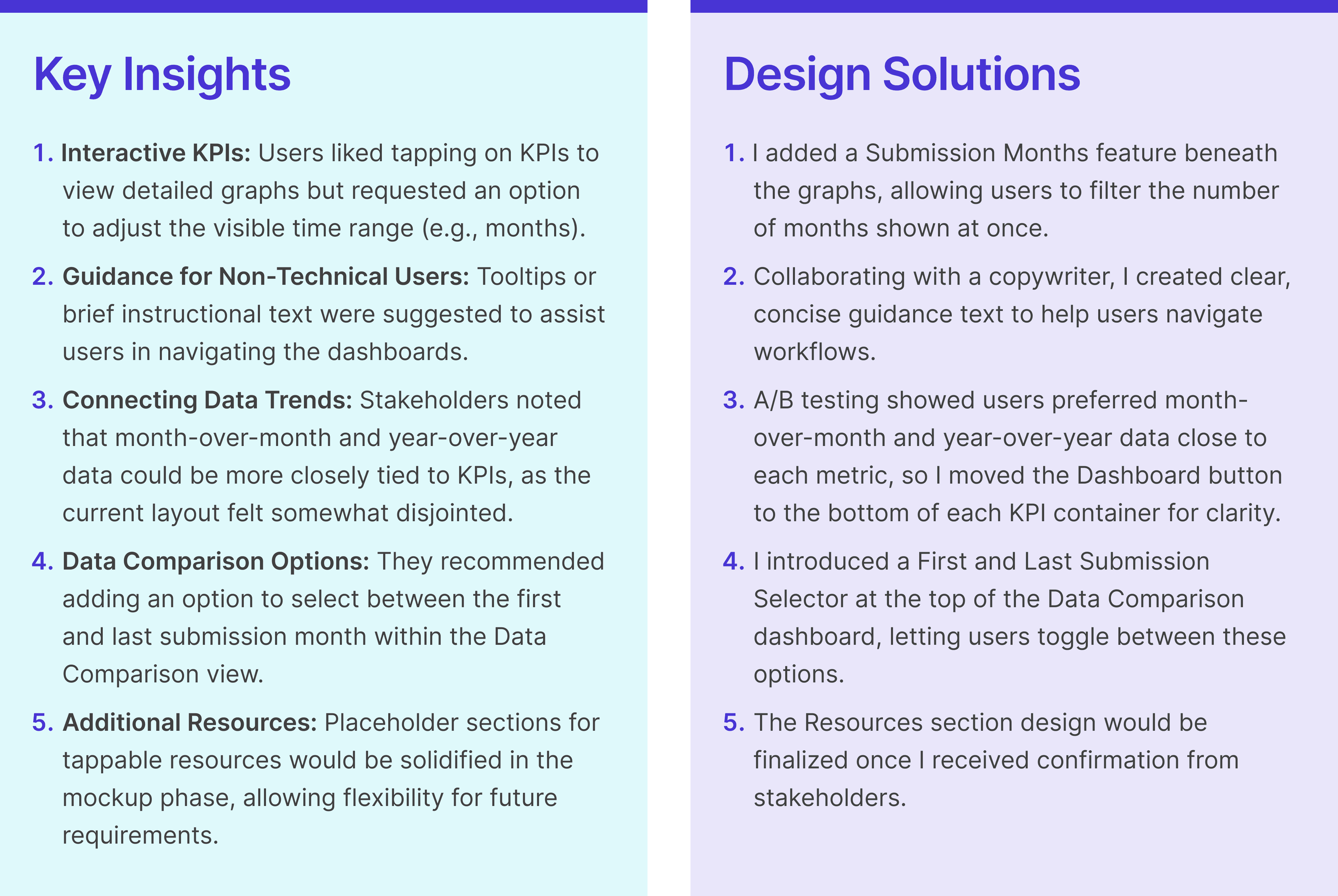
Stakeholder input for customizable data and user-friendly tips
After reviewing the wireframes, stakeholders shared their feedback in a spreadsheet, which helped refine the design before moving on to high-fidelity mockups. Key feedback included:
Creating a unified, mobile-ready solution for all users
To tackle the current challenges and enhance the user experience, I designed a solution that enables customers to engage effortlessly with Freddie Mac and track their loans at every step of the way. By implementing a single sign-on feature across all LAS tools, users will enjoy a smooth and cohesive interaction with the entire suite.
Additionally, I ensured that the BI solutions for the web portal are mobile-friendly, so the app can seamlessly extend the suite’s user experience across all devices. By creating a consistent user experience and optimizing for mobile use, this app not only caters to today’s tech-savvy users but also helps reinforce a fresh brand standard for Freddie Mac’s product suite.
Building a cohesive experience: Harmonizing the LAS login and icons
A key focus for me was ensuring that the LAS app felt like a natural extension of Freddie Mac's broader suite of products. I put a lot of thought into the design of the login screen, making sure it visually matched the LAS web portal. I also created a set of product icons that not only represent each LAS product but also help tie the entire suite together, providing both context and a sense of cohesion.
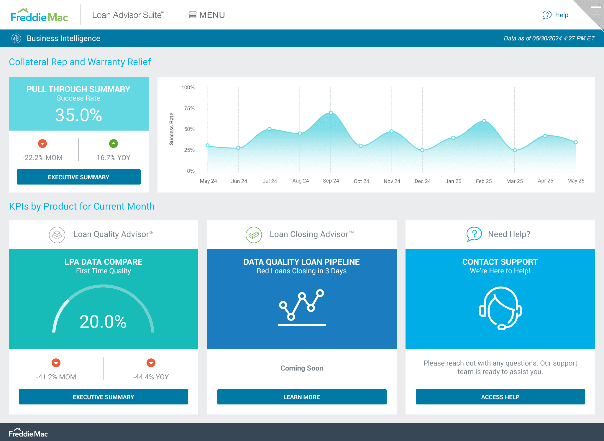
The BI home screen: At-a-glance insights made easy
Early feedback from stakeholders suggested that the initial view should offer a quick snapshot of key data and easy access to other available or upcoming dashboards. To solve for this, I designed the BI Home screen to be a central hub where users can easily navigate to dashboards by tapping the buttons at the bottom of each panel. With large icons, a clean color palette, and key KPIs front and center, users get a clear, high-level overview at a glance.
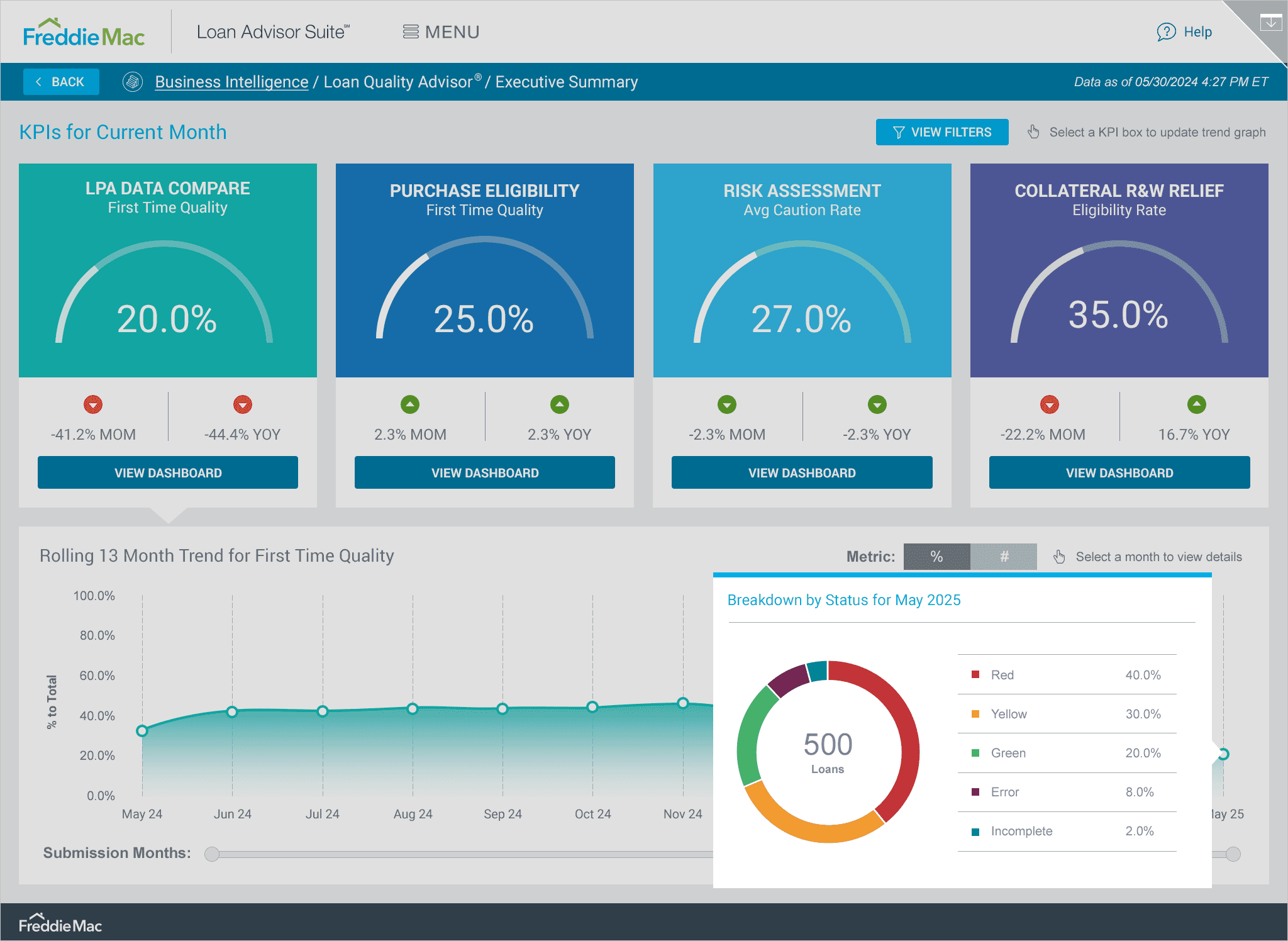
Executive summary: KPIs and trends simplified
For the Executive Summary view, I made sure the top KPIs were front and center, with a trend graph below that could be filtered based on the selected KPI. To keep things user-friendly, I used soothing colors that corresponded with each section and placed them in large, easy-to-read containers. Sharing early prototypes with the team, a piece of feedback was that users needed a way to refine the data by date. With this in mind, I introduced a Time Slider below the graph for quick adjustments and a more granular view. I tested placing the slider both above and below the graph and found that positioning it below felt most intuitive for users. This setup also maximizes horizontal screen space, making the slider easier to use.
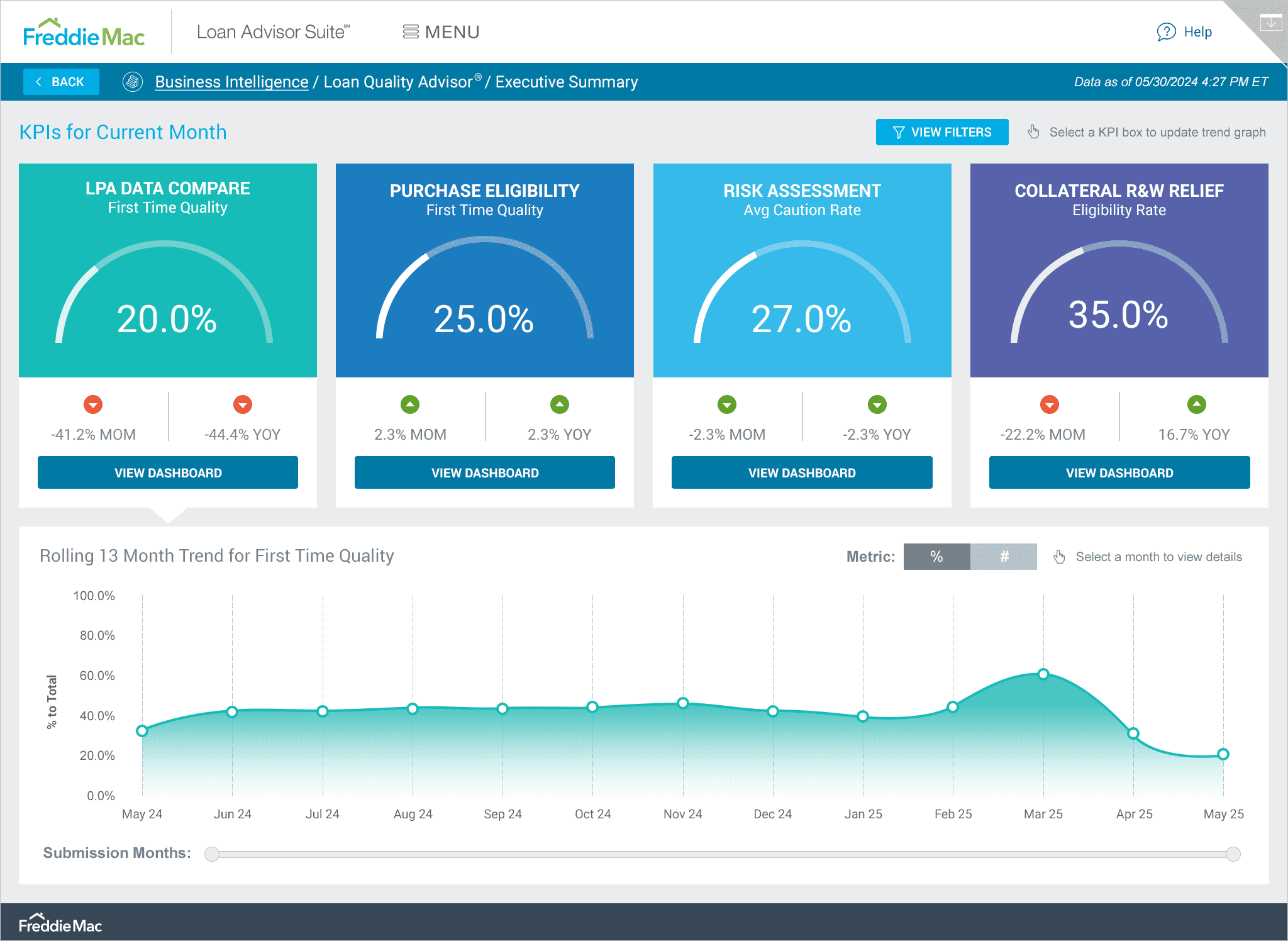
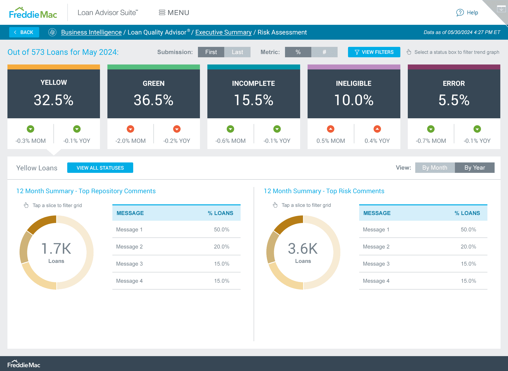
Drilling down: Status breakdown in a tap
One of the key pieces of user feedback was that they wanted it to be easy to see the breakdown of statuses for a specific month. To solve for this using progressive disclosure, I designed a pop-up that shows all the details along with a visual. You can access it simply by tapping on any point or month label. In initial tests, users didn’t realize they could tap a KPI, so I added directive text along with an icon next to the filters button to make this function clearer. Users found this especially helpful, particularly those who weren’t tech-savvy.
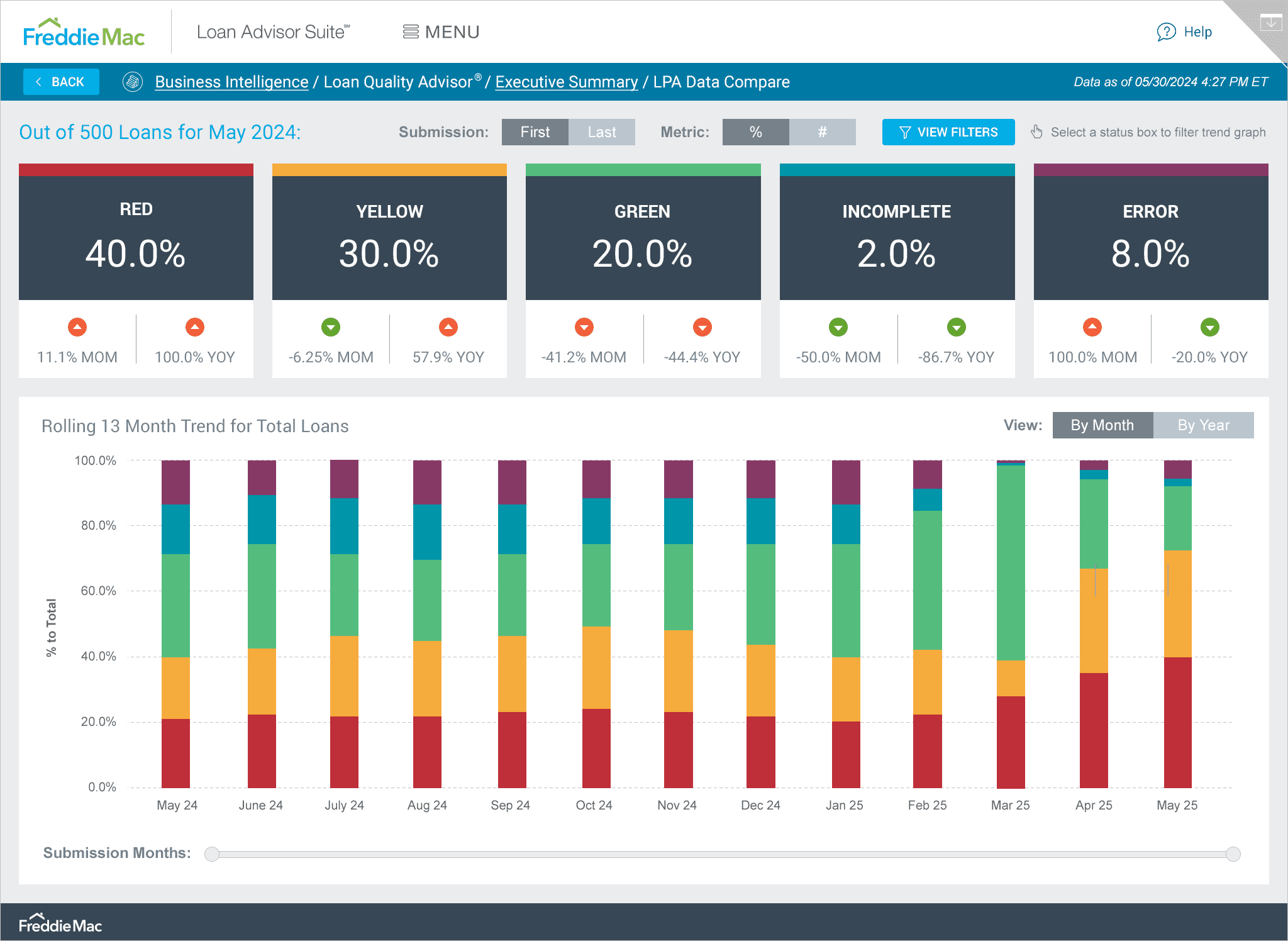
Data Compare Dashboard: Top metrics at your fingertips
A key challenge for this dashboard was color-coding multiple statuses and finding new colors that fit each one while blending smoothly with the existing palette. I designed the LPA Data Compare dashboard to clearly showcase the top metrics at a glance and providing a trend graph for each metric available upon tapping. Everything an executive needs to know is clearly visible and accessed within the first few minutes of accessing the dashboard.
Annotation and sharing: Making notes easier to share
During the user interviews, it became clear that execs needed a way to annotate and share their notes with others based on the data. So, I created an Annotate and Share feature that's easily accessible from the upper right corner menu. Once they've added notes to a trend graph, they can simply select the Email Screen function in the same menu to share the specific screen with others.
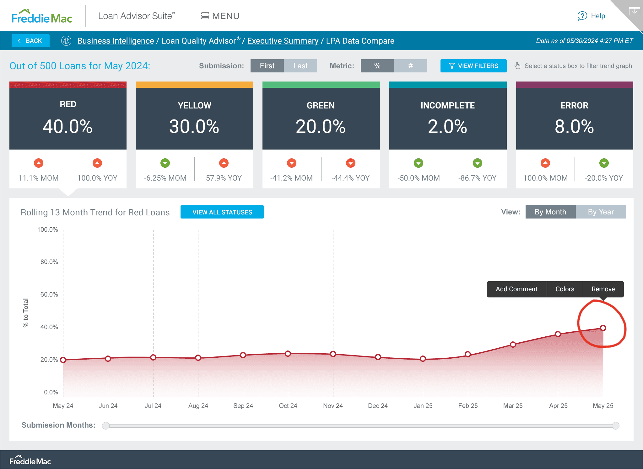
Interactive visuals for quick data exploration
I designed tappable visuals so users could easily drill down to specific data. For example, when you're in the Year view, you can filter the grids by simply tapping on a section of the pie chart.
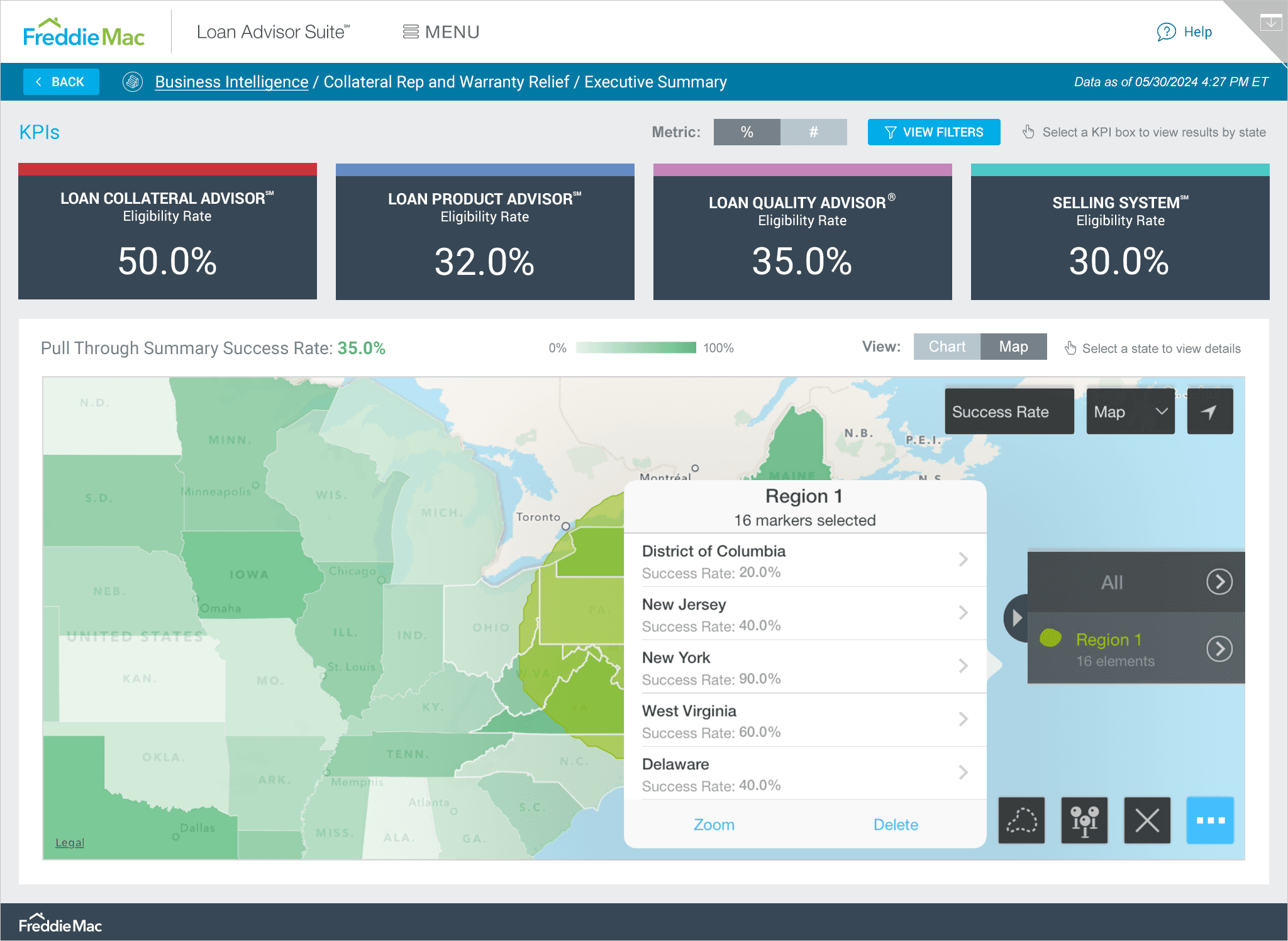
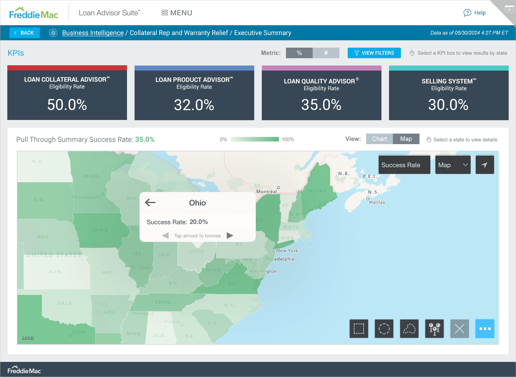
A clear data journey with Sankey and map views
Throughout this project, my goal was to present the data in the most concise and digestible way, whether that was through a trend graph, pie chart, or in this case, a Sankey diagram. On the Collateral Rep and Warranty Relief dashboard, users see this diagram alongside key KPIs, with the option to toggle to a Map view. Understanding the data deeply was crucial so I could present it in the most user-friendly way possible.
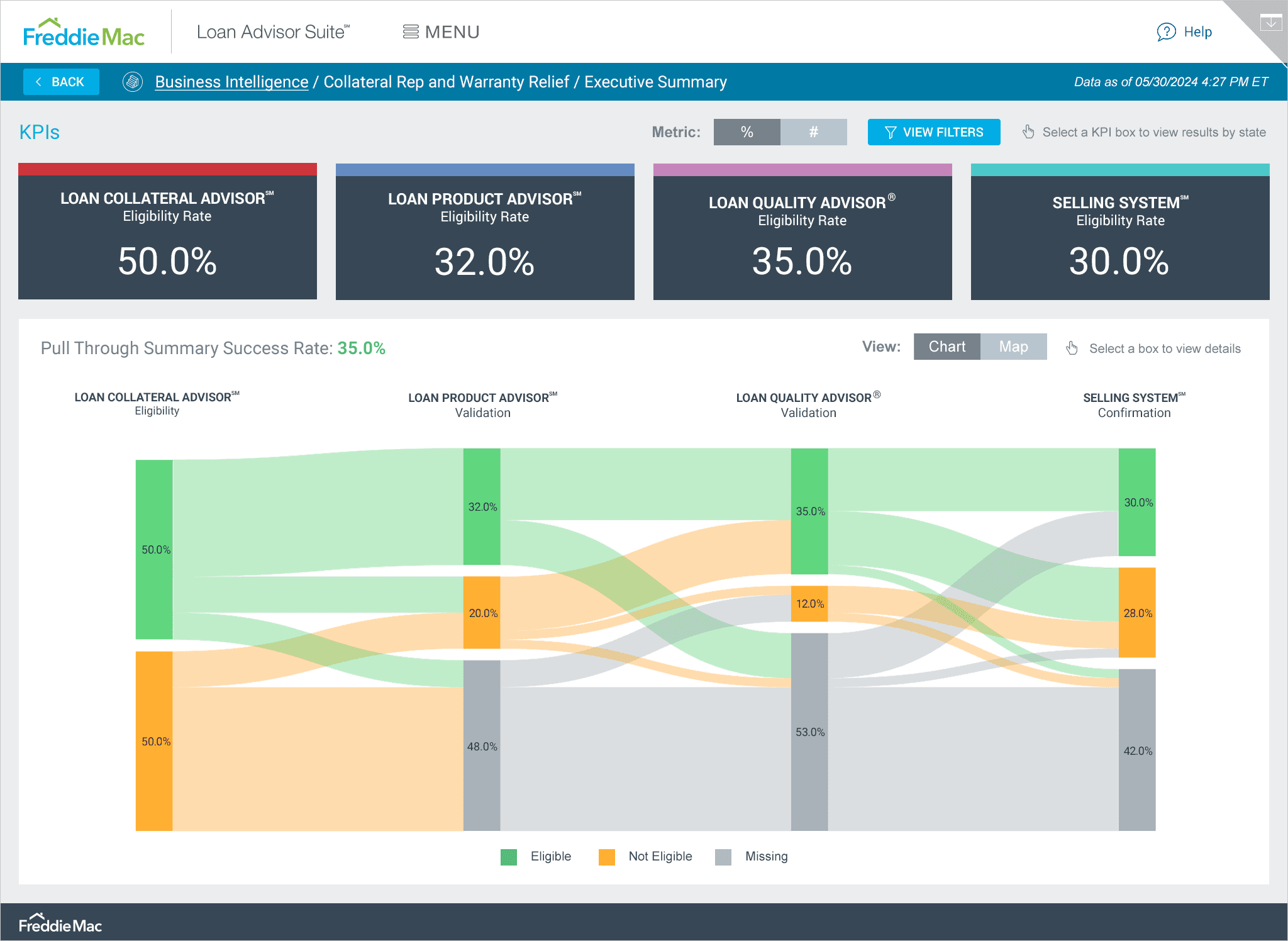
Digging deeper: Pull through rates by region
Users also requested the ability to drill down into different areas for more granular insights, so I began to research how other apps did this and met with the development team to come up with a solution. I worked closely with dev to design and implement a feature allowing users to see Pull Through Summary Success Rates for different areas within a selected region. Once a region is selected, a contextual menu pops up, allowing users to select a specific area for deeper insights, leading to more thorough reporting.
From launch to liftoff: Celebrating feedback and bright ideas ahead
Since launching the new app, executives have given great feedback about its simplified and intuitive interface. It’s saved them a lot of time and helped them derive results much faster, which is a huge win in my book.
Launching a product is just the beginning though. During our discussions with the development team and stakeholders, we came up with some great ideas for new features (exploring different dashboard views/profiles for levels of management for example.) We're planning to do user testing and might include these features in future updates. We also need to determine how to handle cases when data isn’t available and find a clear way to display this to the user. This will be one of the first things we tackle.
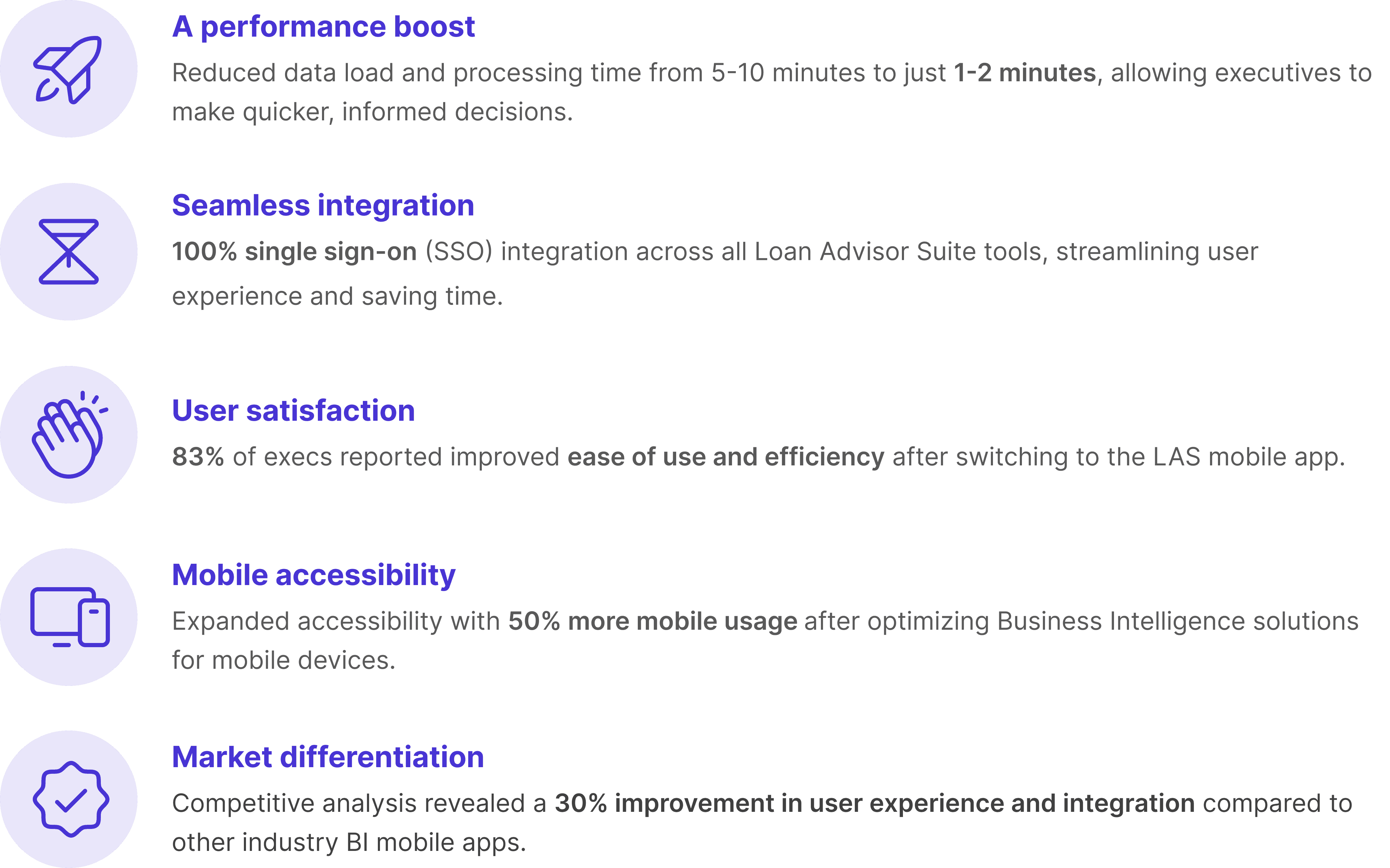
Here are some key improvements we documented post-launch:
Evolving the LAS mobile app for future success
Wrapping up, the journey with the LAS Mobile App has been quite a rewarding experience. By using the Double Diamond Theory and Lean UX principles, I’ve crafted a solution that really speaks to what Freddie Mac's executives are looking for. The positive feedback highlights just how important speed, simplicity, and seamless access are in today’s fast-paced loan processing world.
As we look ahead to future enhancements and features, the focus will stay on refining the app to keep it aligned with user needs while improving the LAS experience for everyone involved.