Boosting user satisfaction by 40% through simplified navigation and accessible design
I designed the CPS Community Toolkit from the ground up, boosting user satisfaction by 40% through intuitive navigation and accessible design. Leading research with parents, educators, and community members, I collaborated with developers, a business analyst, and my project manager to build a site that makes finding resources and school information easy for everyone across all 600+ CPS schools.
Glorified pixel-pusher and so much more
Design lead, Product strategy, User research, Interaction, Wireframing, Visual design, Prototyping & testing, IA
Product impact: KPIs driving positive community change
Bringing the community together
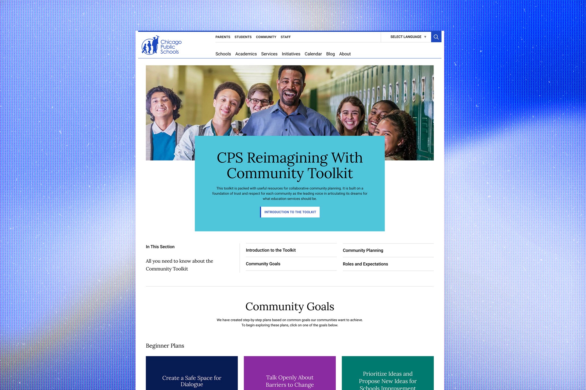
The CPS Community Toolkit project aimed to create a welcoming space where community members, educators, parents, and students could easily access resources to connect more deeply with their schools and neighborhoods. The goal was simple yet ambitious: to design a user-friendly, accessible hub that could house everything from educational guides to community workshops.
Over 2.5 months, my mission was to bring this vision to life by understanding user needs, designing with empathy, and delivering a platform that was both intuitive and practical. With tools like Figma, UserTesting.com, and Google Analytics, I focused on making every decision user-centered, ensuring a seamless and meaningful experience.
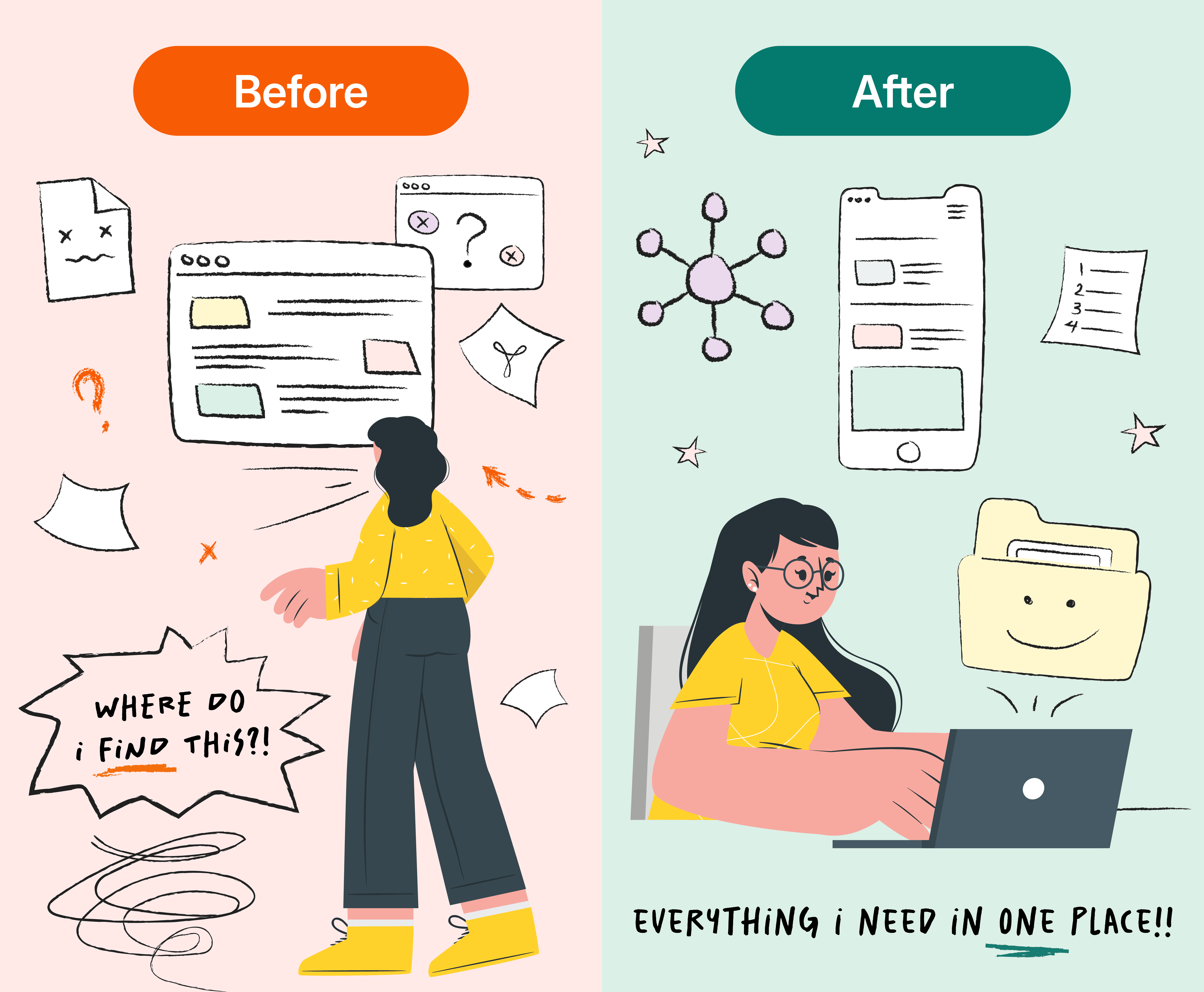
Addressing the problem: Scattered resources and user frustration
Before we kicked off this project, resources were scattered across various platforms, and users often struggled to find the information they needed. The lack of a central, intuitive hub caused confusion and frustration, especially for community members who weren’t tech-savvy. Moreover, the diverse content types (guides, worksheets, interactive tools) needed a well-thought-out structure to prevent users from feeling overwhelmed. Simply put, a central source of truth was needed to help foster growth and team-building in the community workshops.
What I learned: Personalization matters for our users
To get a solid understanding of users and their pain points, I began to research. I conducted user interviews, surveys, and card sorting exercises to see how users categorized information and what they found most important.
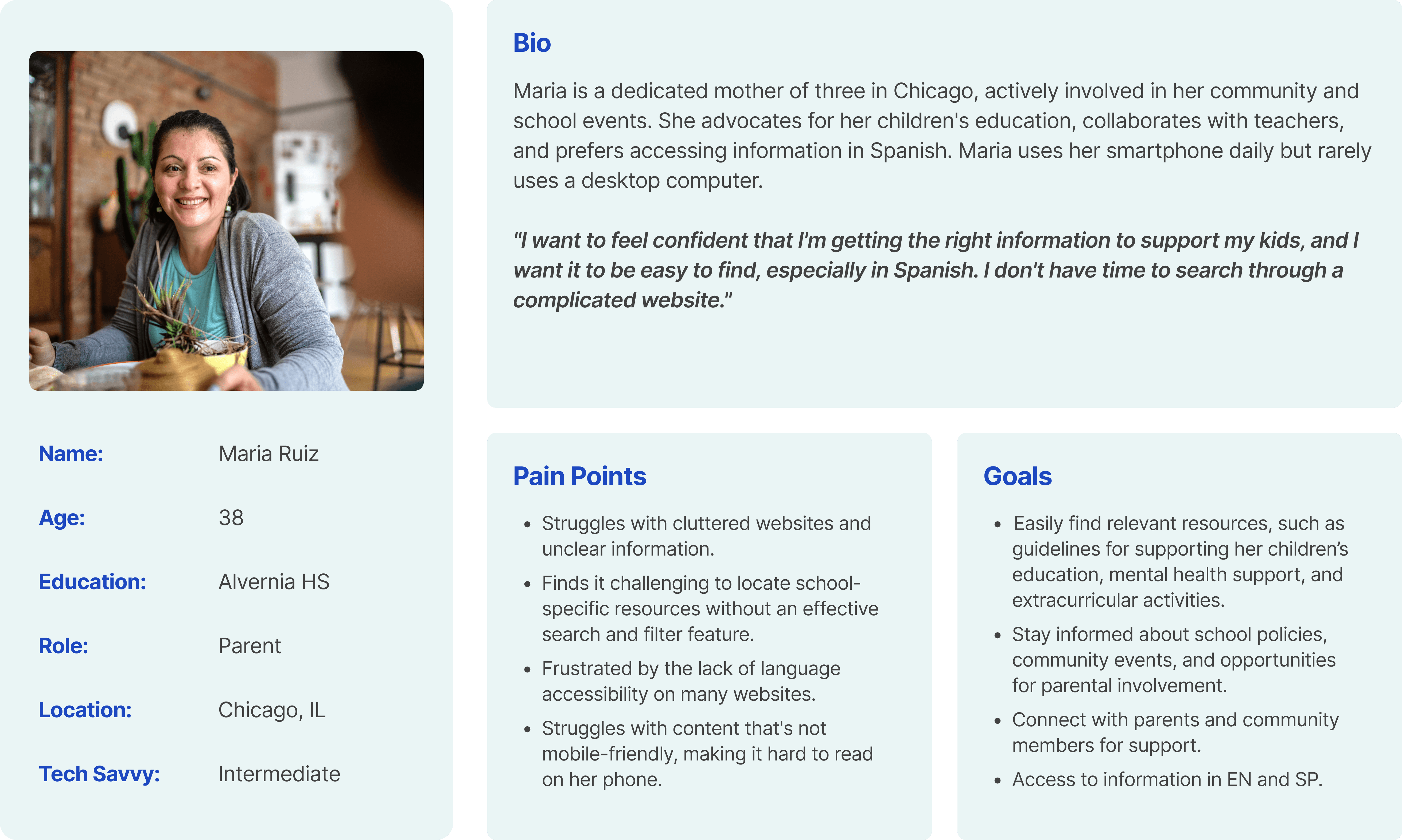
By interviewing parents and reviewing survey results, I gained a clearer understanding of our users and captured these findings in an empathy map.
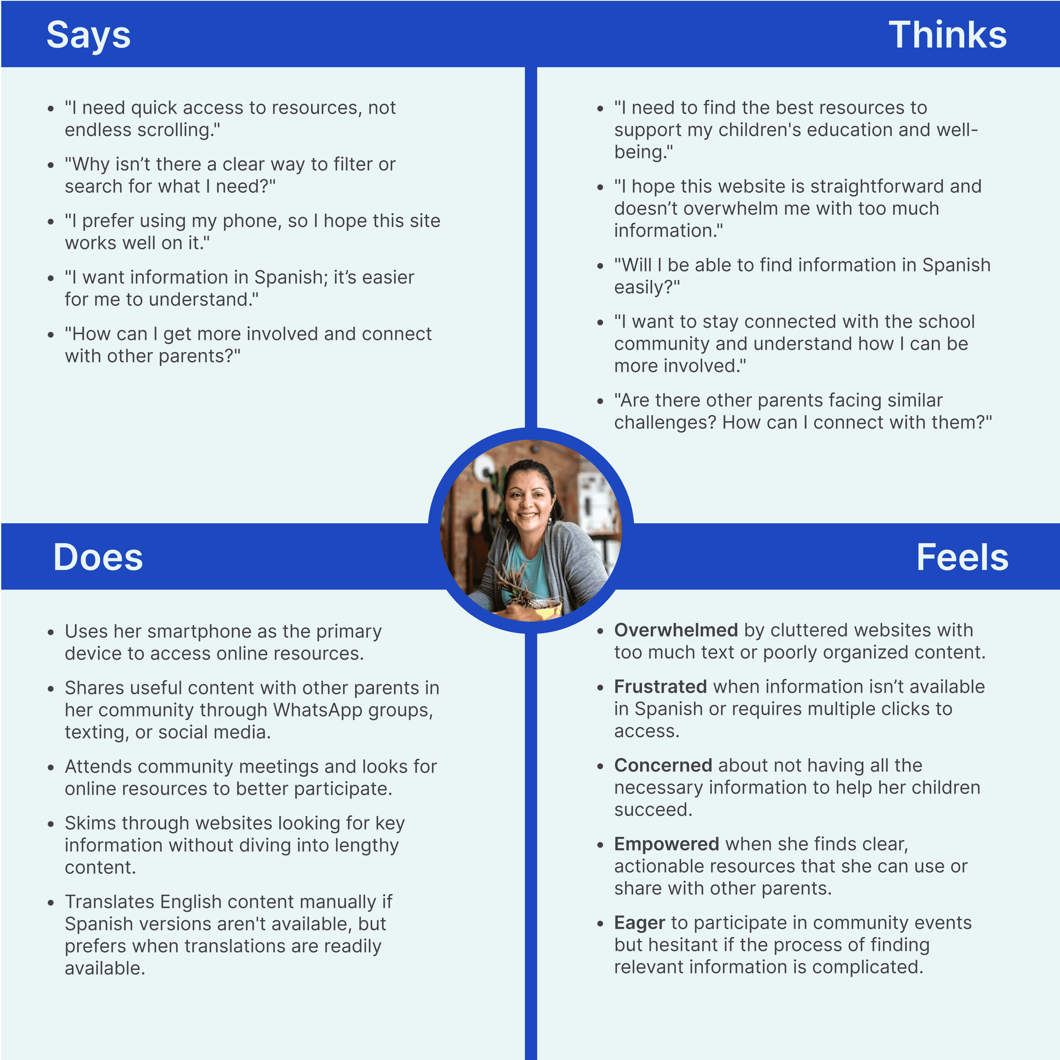
These insights guided the project, helping us create a more user-friendly design:
Starting with a plan
Tree testing was incredibly helpful in shaping the CPS Community Toolkit site. It revealed how real users would interact with the structure and helped me frame every decision around making the site more intuitive and user-friendly.
I began by outlining the main categories and subcategories for the site, grouping related content together. This was the first draft of how I thought the site should be organized.
Testing with users
I then took this structure and presented it in a simplified format to users. They were asked to find information like “Where’s the community workshop schedule?” or “How do I access resources for educators?”
Watching how users navigated an early version of the site helped me see which parts of the structure were confusing or misplaced. For instance, I noticed that some categories weren’t where users expected them to be, which led to further adjustments.
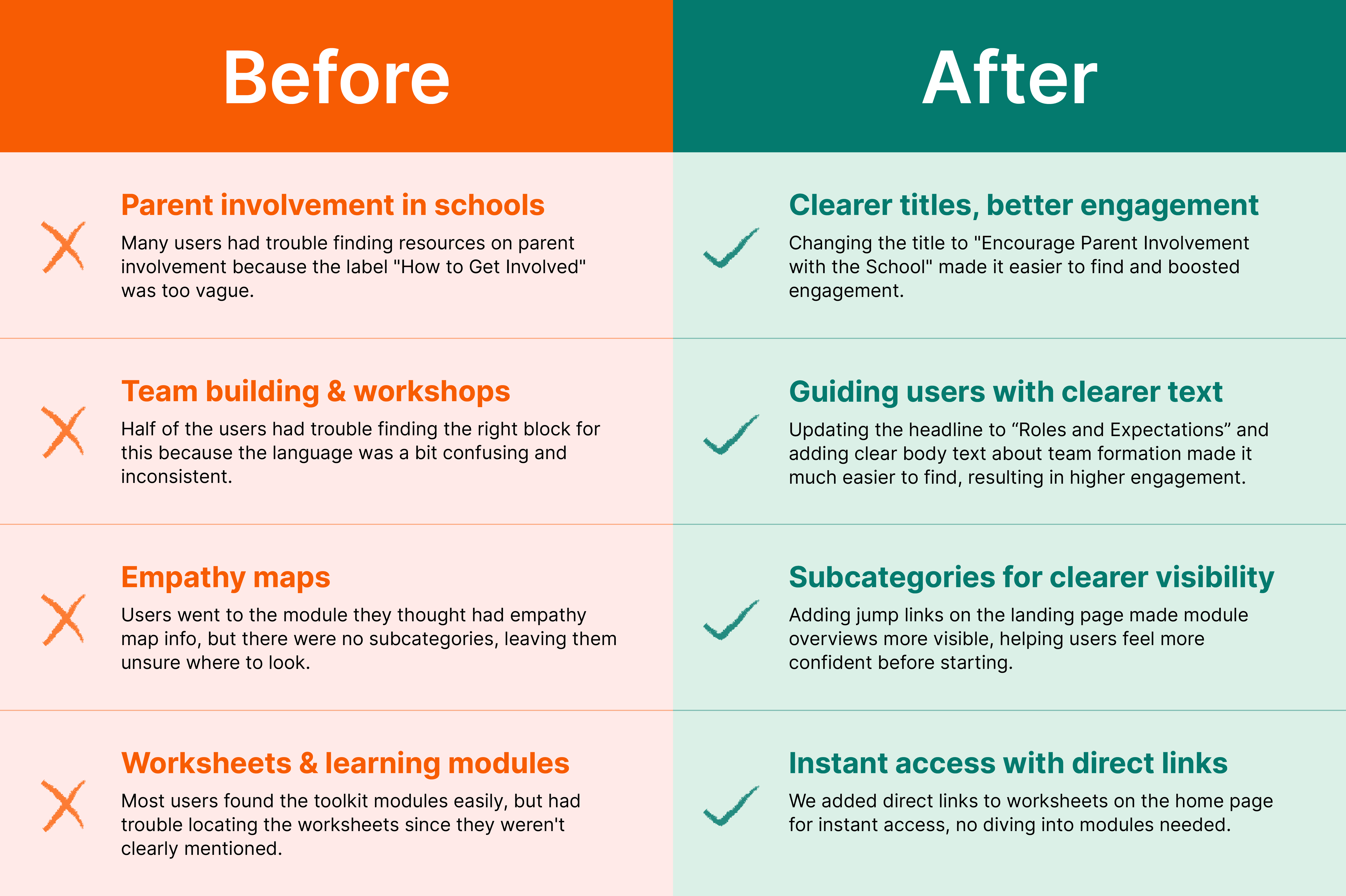
What I learned rearranging categories
Users had a hard time finding certain resources because they were buried in the wrong categories. This feedback prompted me to move things around to make sure related content was grouped together in a way that made sense.
Simplifying the structure
I learned that having too many nested categories was overwhelming. Users preferred a simpler, more straightforward layout, so I flattened the structure to make it easier to navigate.
Improving labels
Some labels were too vague or confusing. Based on user feedback, the team updated these to be clearer and more descriptive, making it easier for users to understand what they were looking at.
From research to reality: Crafting a design that speaks to users
With the research insights in hand, it was time to dive into the design process.
Here’s how I approached it:
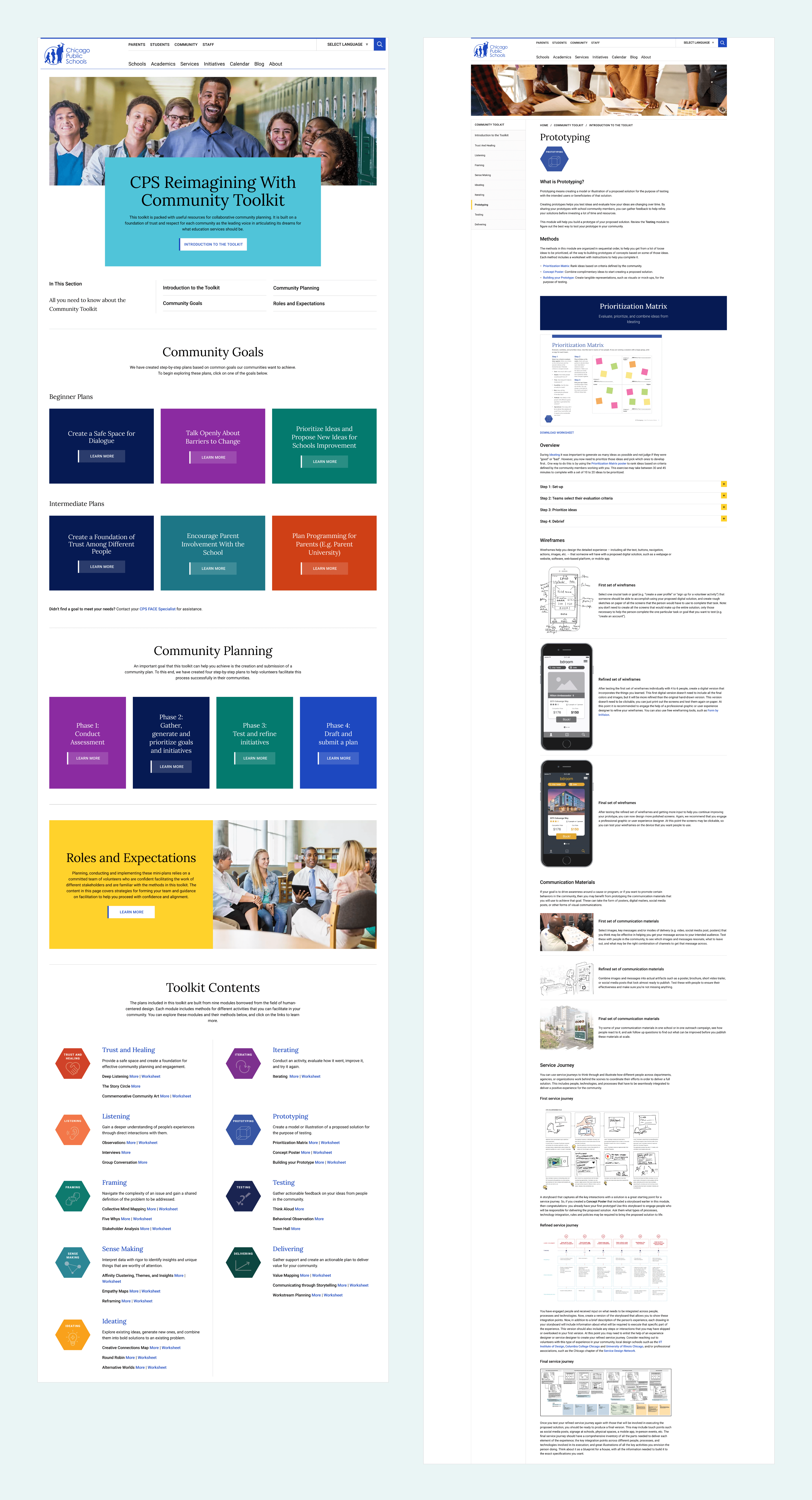
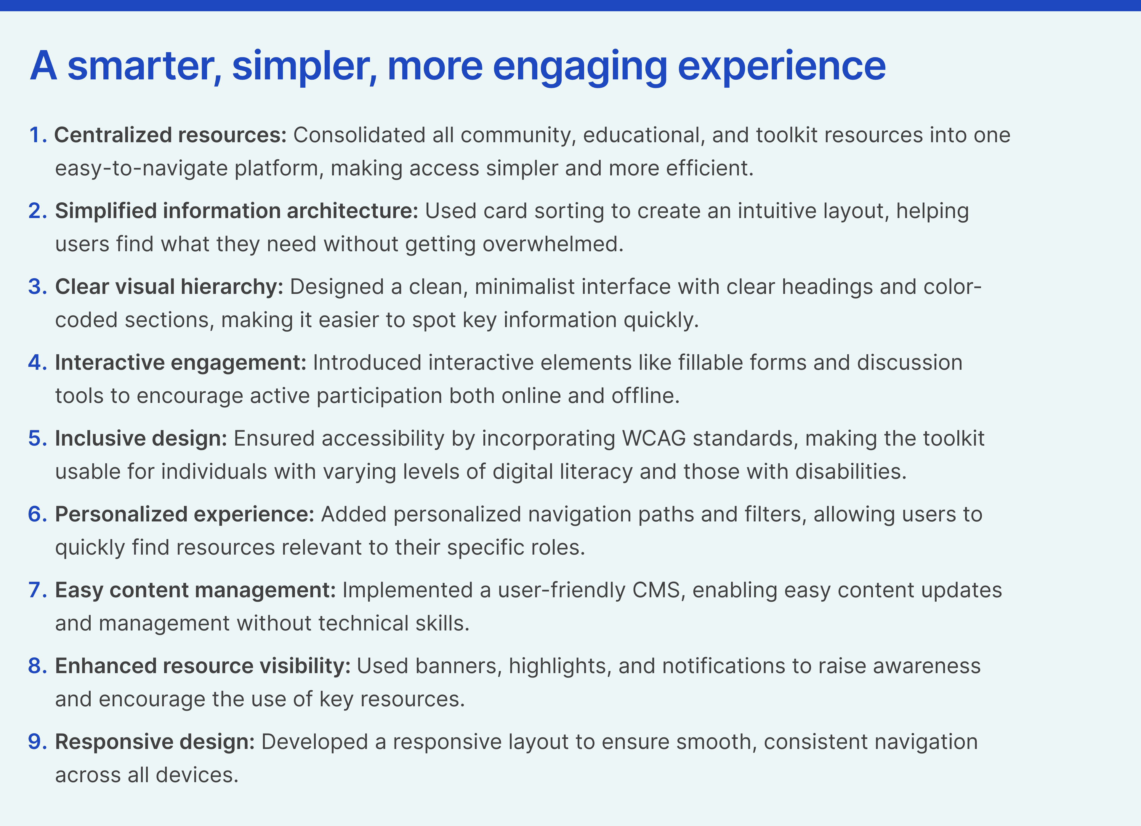
Building an intuitive information architecture. Using insights from card sorting, I structured the site to have a clean and logical flow. The content was grouped into clear categories, making navigation intuitive and straightforward.
Creating engaging visuals and hierarchies. I applied minimalist design principles with a strong visual hierarchy—bold headings, clear call-to-actions, and a consistent color scheme—to guide users smoothly through the site. By leveraging the existing CPS CMS and branding, I created a seamless experience that built trust, increased familiarity, and simplified user onboarding.
Interactive elements for better engagement. I introduced interactive elements like downloadable worksheets, fillable forms, and sections for community feedback. These worksheets were designed to be print-friendly, allowing users to engage both online and offline.
Personalized user journeys. I implemented personalized navigation paths where users could select their roles (parent, educator) and immediately see content relevant to them. This decision was key to making the site feel more personalized and user-friendly.
Bringing the design to life: Implementation with precision
Working closely with the development team, I ensured that the design was translated as truthfully as possible into the live site, taking into consideration certain limitations within the CMS.
Key steps in the implementation included:
The site was built with a responsive layout that adjusted seamlessly across desktops, tablets, and mobile devices. I designed new components where needed based on content provided by the client.
We followed WCAG standards to ensure accessibility, incorporating features like high-contrast text, screen reader compatibility, and simple language. This made the site usable for everyone, regardless of ability or background.
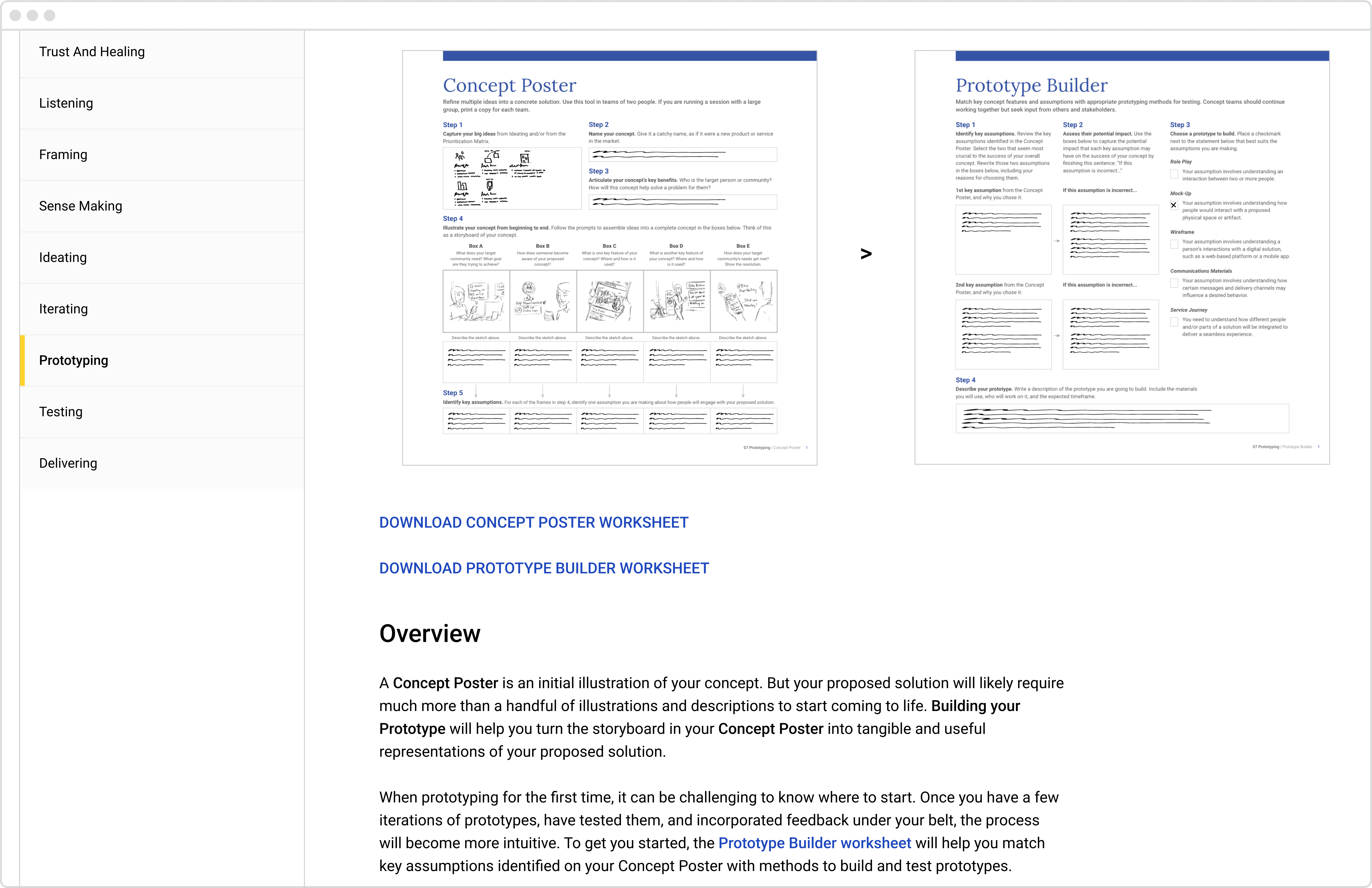
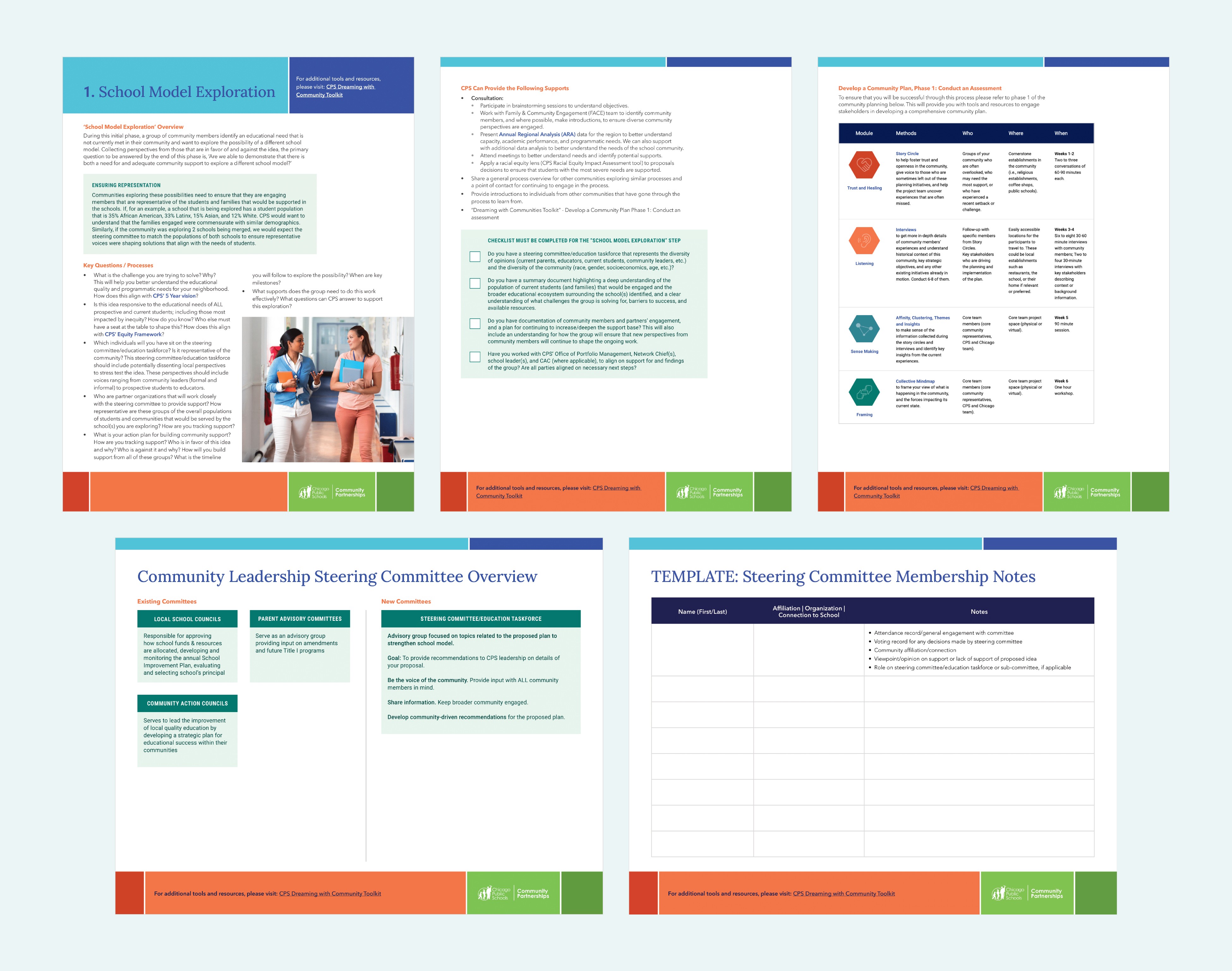
For each module, I designed custom illustrations to simplify complex ideas and community worksheets for workshop activities.
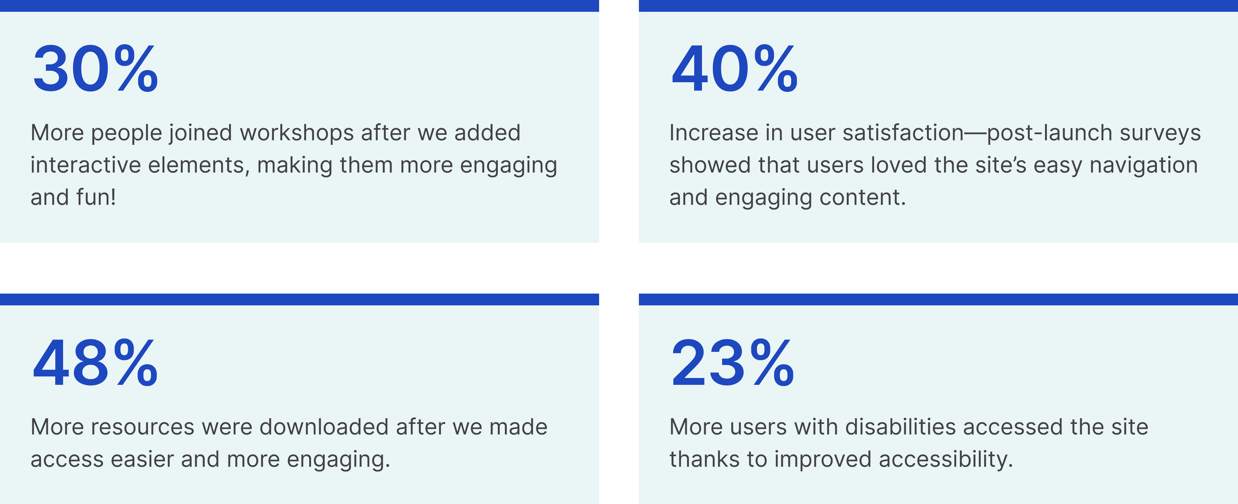
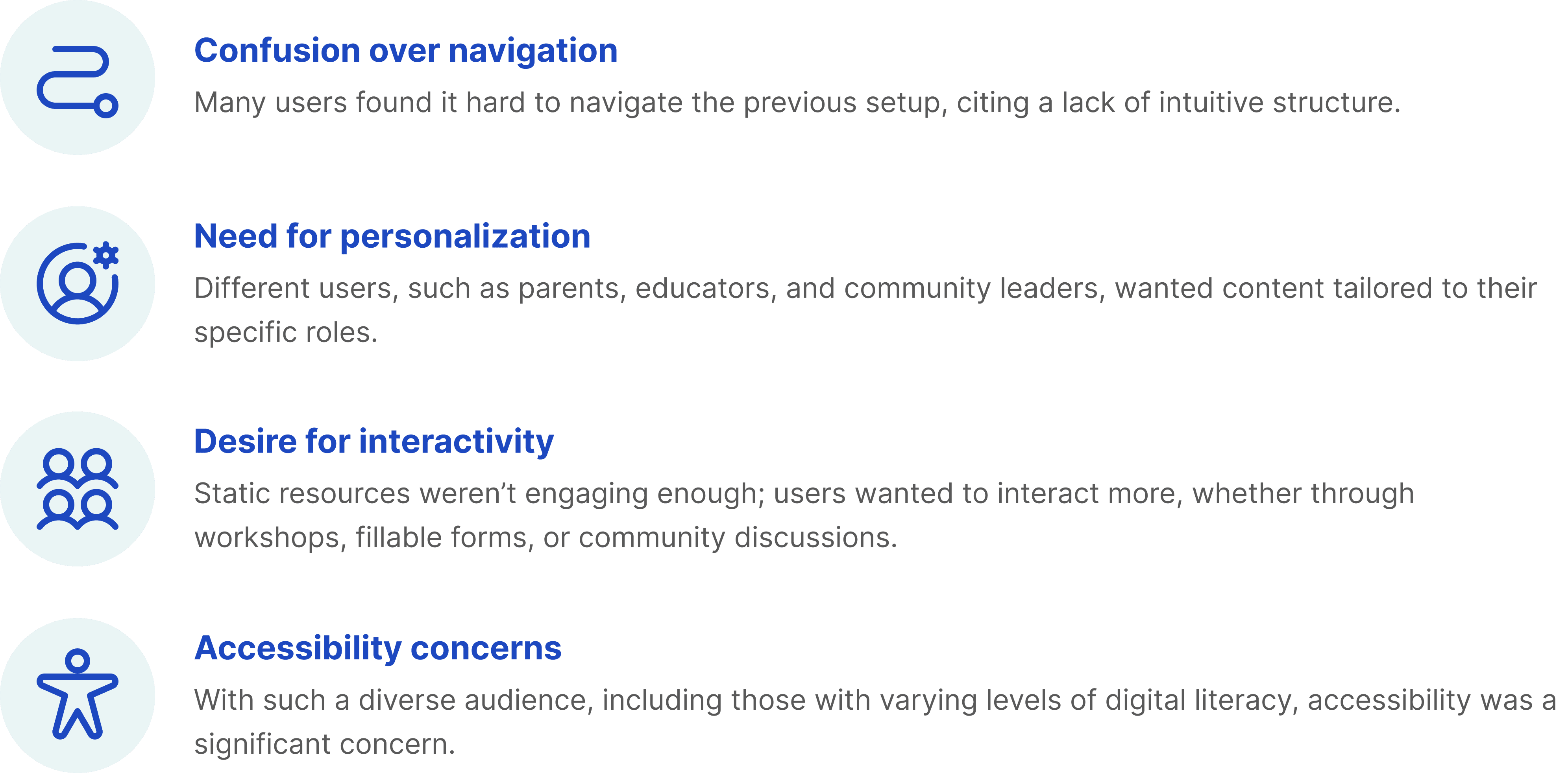
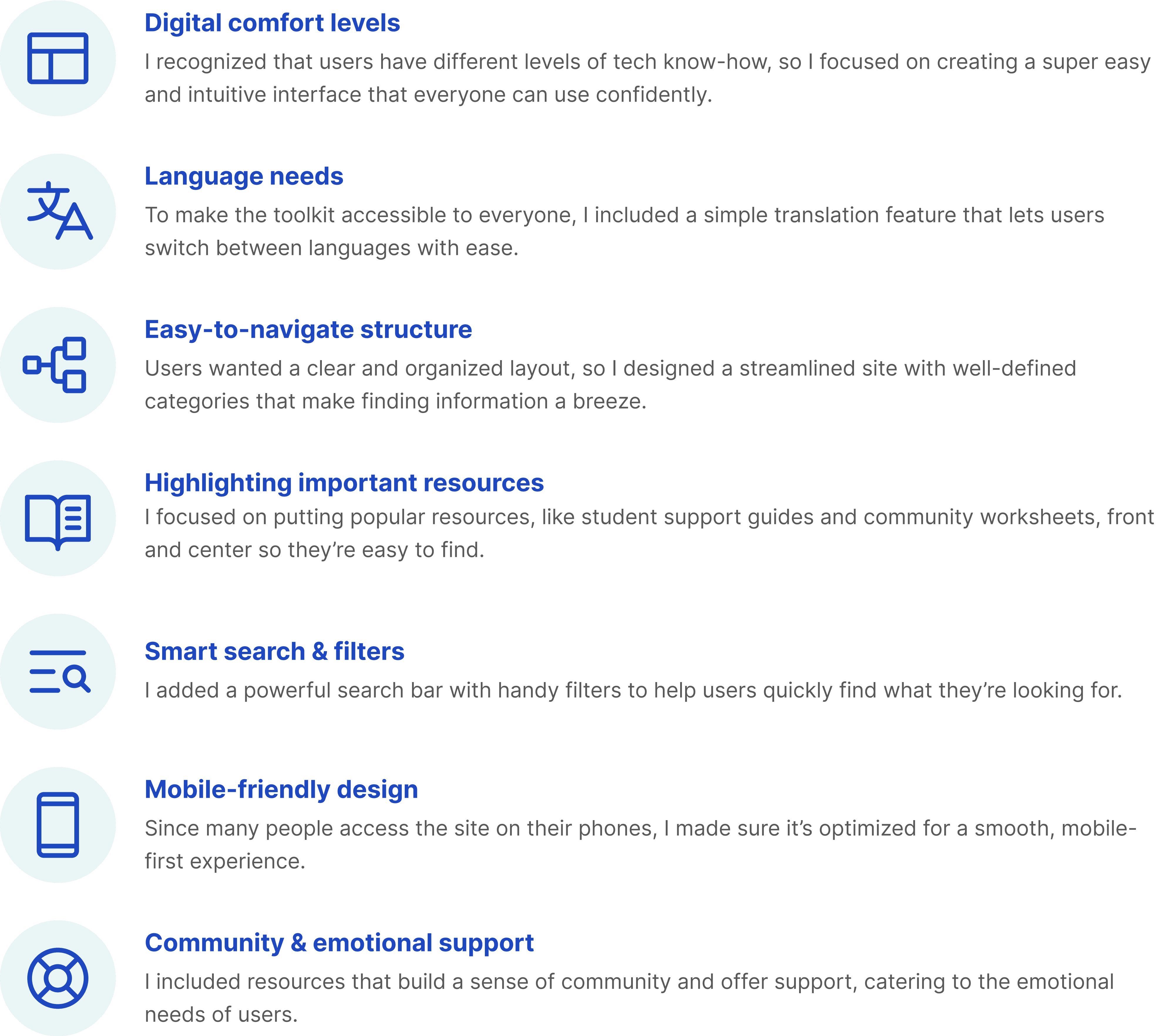
What users loved: Simplified navigation, interactive tools, and improved accessibility
Once the site was up, I conducted virtual usability tests with various user groups, including parents, educators, and community leaders.
Here’s what I found:
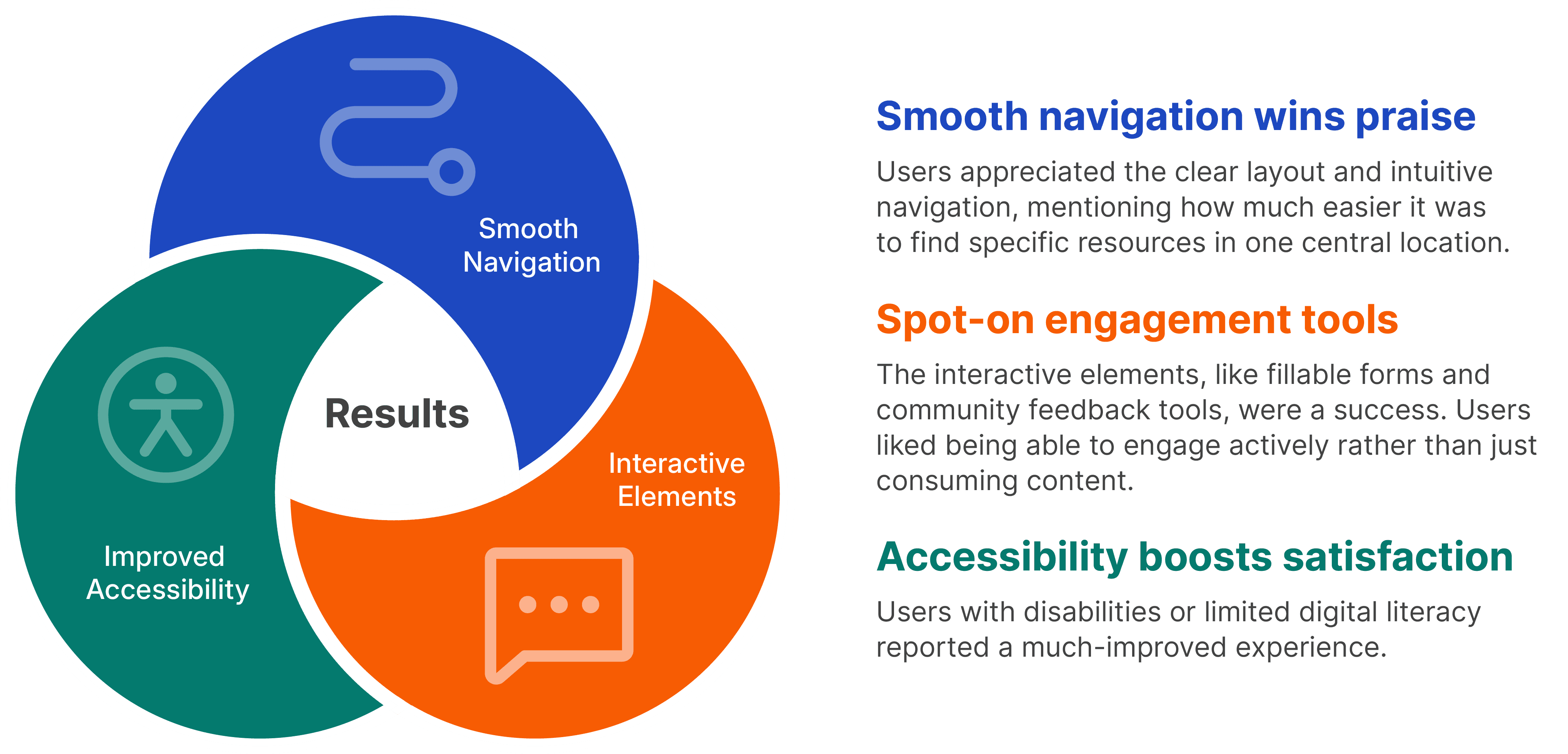
I took this feedback and made a few tweaks to improve things further. For instance, we fine-tuned the search function and added helpful features like tooltips and quick start guides to make the site even easier to use.
Key takeaways: Why user feedback and iteration are essential
The new CPS Community Toolkit site launched with a great response from the community.
Here’s what I learned along the way:
User-centric design is crucial. Engaging directly with users throughout the design process provided invaluable insights that shaped the final product. Designing in a vacuum is self-serving and benefits no one in the long run.
Learning how to leverage an existing CMS. The limitations of an existing CMS helped guide design decisions throughout the process and ultimately saved a lot of time and rework. On the flip side, new components were introduced that would have been more complicated to implement had I not been aware of these limitations.
Iterative design matters. Regular testing and iteration allowed the team to refine features based on real user feedback, creating a better experience for everyone.
Clear communication is key. Presenting complex information in a digestible and accessible format made the toolkit more effective and user-friendly.
What we achieved together through this project:
Overall, this project was a great learning experience and a testament to the power of user-focused design. It brought together the community in new and meaningful ways, creating a valuable educational resource hub that is both accessible and engaging.